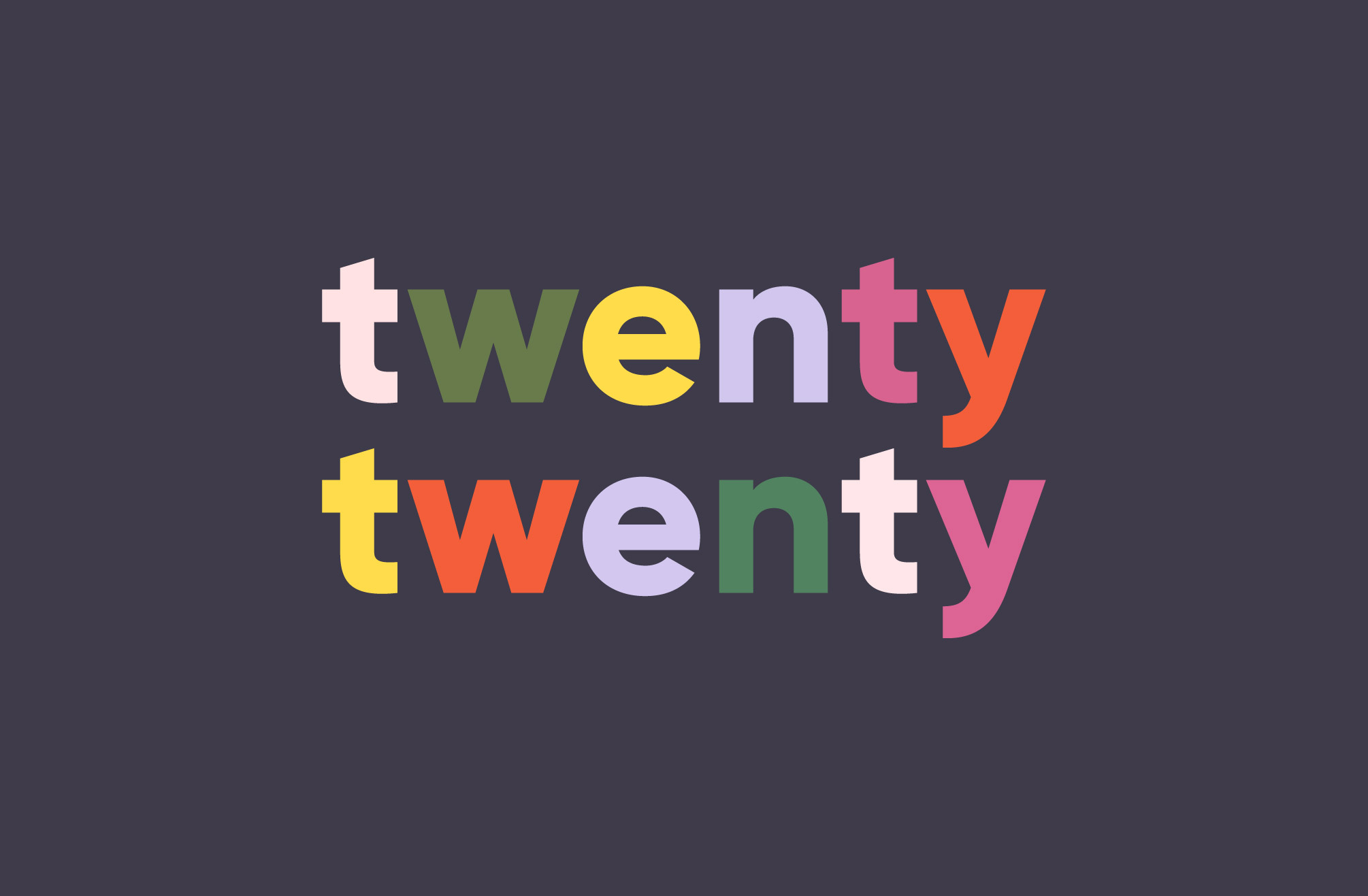
WordPress 5.3 is here including the new Twenty Twenty default theme. It’s an exciting WordPress release because it’s including a number of new default block features and general improvements to the editor experience. I will write more about the new features in WordPress 5.3 in a separate post, for now let’s have a look at the new theme.
Twenty Twenty is a fork of Anders Noréns’ free theme Chaplin. Anders was also lead of the design team for Twenty Twenty. I like that the theme was designed by a member of the WordPress community. Forking an already existing free theme with theme designer himself to lead the design team for the new default theme is a first for WordPress as far as I know. The result is more polished since it builds on work already put into the original theme, considering the short time frame available for the Twenty Twenty design team.
Now let’s dive into the theme features and customization options of Twenty Twenty:
Twenty Twenty and Gutenberg blocks?
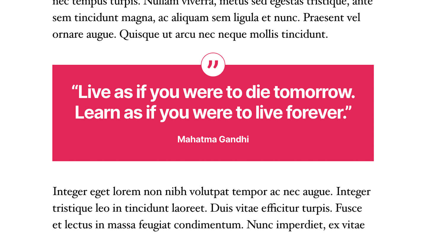
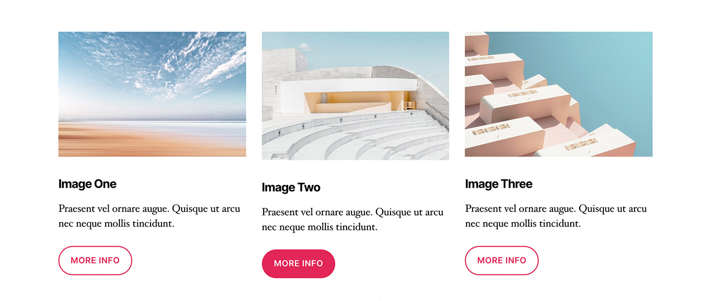
It seems like the main focus for this theme was to seamlessly integrate with the WordPress default blocks, creating an editing experience in the new editor that is smooth and natural. I think the theme has accomplished this. All default blocks look polished in the editor and on the frontend. Personally, I think writing posts gets more exciting with this new default theme. You can create multi column content areas, include quotes, pull quotes or image galleries.
In my opinion, the theme is not yet ready for creating more complex page layouts, e.g. for business websites, but this was also not necessarily the main focus for Twenty Twenty. As we move forward with the new editor, maybe next year’s default theme will have options for more design and complexity.
I wanted to see how well our Aino blocks will work with Twenty Twenty and I was pleasantly surprised with how well this works. I also played around with other block plugins and I would love to hear of your experience on how well other blocks work in the new theme.
Page Templates (Default, Full Width, Cover)
One of Twenty Twenty’s features are the Pages Templates, which are available on pages and posts.
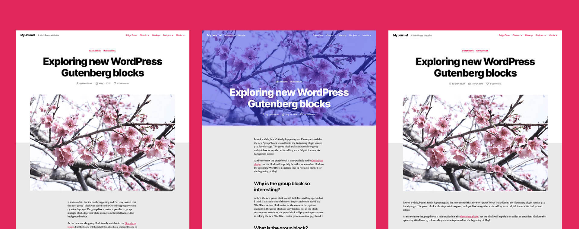
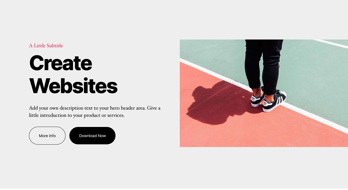
You have the default post and page template with a desktop content with of 580 pixels. If you include a Featured Image in the Default template, the Featured Image is visible below the title. The header background color is used for the background above the fold. Everything below will be in the background color (or background image).
The Full Width template works as the default template, the only difference is the default content width switches to 1200 pixels.
I found it difficult to hide the page title if you want to create your own page layouts not showing the page title, since the theme does not offer an “empty canvas” style template. You would need to work with custom CSS to achieve that.
The Cover template uses the post or page Featured Image as a header background image. There is a default overlay color with opacity visible, which can be changed or deleted in the Customizer.
Customizer Options
Twenty Twenty offers a number of straightforward options in the Customizer. One nice feature I discovered is the Retina logo option under “Site Identity”. This makes it easy to include Retina-ready logo images to the header.
The color options are standard – with a main background color, the header and footer color (I would have loved to see them separated) and the Primary color.
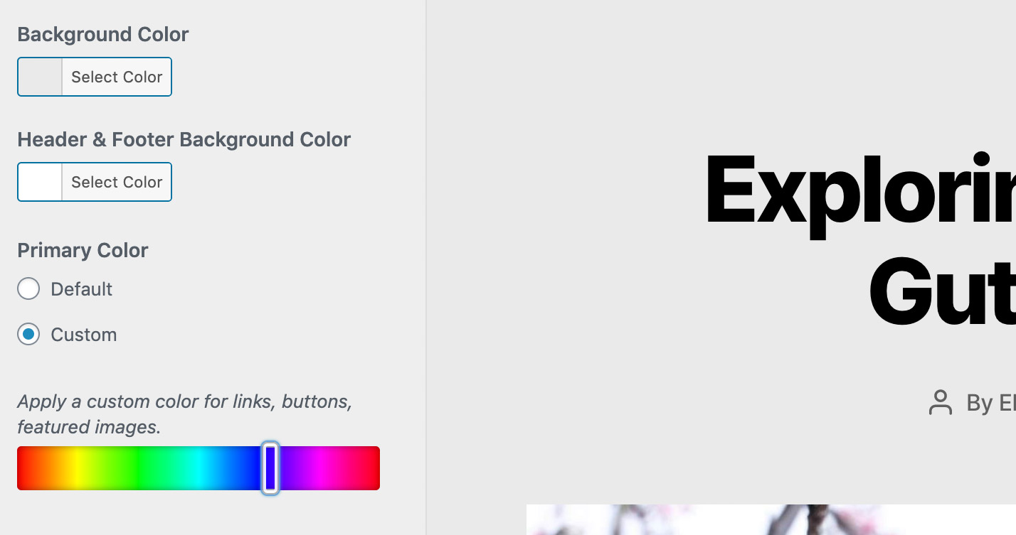
When testing the theme, I thought that it would have been helpful to see the explanation of what the primary color actually does from the beginning, not only when clicking on “Custom”. The Primary color changes the link color, button and the default Cover block overlay color.
Under Theme Options, you can hide the search form and choose between excerpt and full length posts, which are both much needed options.
The next Customizer Tab is the Cover Template settings, which is the most unique feature of Twenty Twenty.
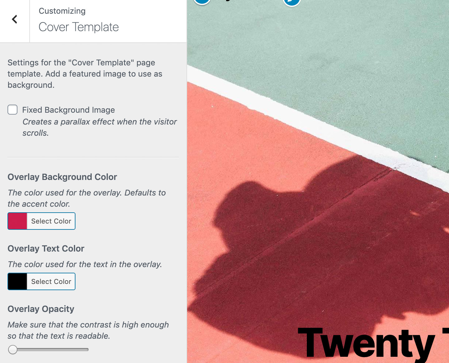
Here you can choose to have the Featured image in a fixed-positioned so that it doesn’t scroll with the page, but instead an overlap effect is created. You can also choose the overlay background and text color as well as the opacity level.
The next Customizer option “Background Image” can be unclear for beginners, since it might be confused with the Cover Template background image (which is the post or page Featured Image).
The Background Image option is instead used for the entire background of the website and it is visible on every page. In my opinion, it would have been better to only show the Background image on the front page, making it possible to create a background pattern for the front page. Showing the background image on every page and post it is a bit overwhelming for website users.
Available Menus
Since the header navigation area can not yet be built with Gutenberg, you choose your menu positions in the Customizer under Menus / Menu Locations. Twenty Twenty offers a Social Links menu, which is visible in the open mobile menu and at the top right corner of the footer.
The top-level only (sub level menu items are not visible) Footer menu is positioned at the top left of the Footer area. It’s interesting that the theme uses two options for the main menu on desktop screens and one extra menu for mobile screens. I like the flexibility to choose my menus separately, although this might be a difficult option to understand for beginners.
Footer Options
As mentioned above, the Footer menu and Social menu are visible on the top of the footer area. Twenty Twenty also comes with two footer widget areas. I personally like the Back To Top button in the footer, which is a helpful feature especially if you have long pages and/or posts.
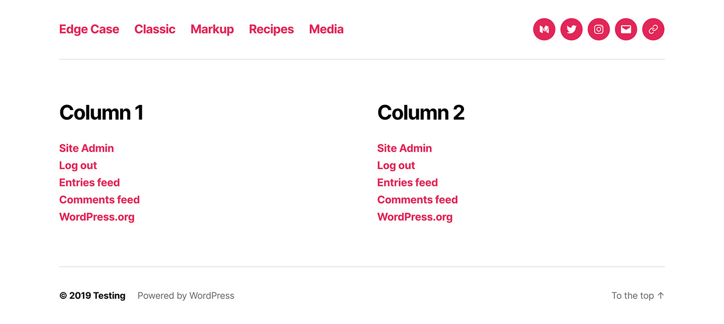
Image Sizes
Twenty Twenty uses a Featured Image width of 1200 pixels. The Cover image size is 1980 pixels. If you include bigger images, the correct image sizes will be generated and used by the theme. You just need to make sure that you don’t include smaller images for Featured and Cover Images, otherwise your images will not look sharp.
Conclusion
I hope you enjoyed this walkthrough of the options and features the Twenty Twenty theme offers. Do you like the design of the theme? Which are your favourite features and which options do you think are missing? Do you think Twenty Twenty is a blog theme or would you also consider using it for a portfolio or business website? I would love to hear your thoughts so feel free to comment below.
Leave a Reply