Table of Contents:
1. Theme Installation2. Creating the Front Page3. Widget Areas and Widgets4. Theme Options5. Custom Menus6. Typography Styles7. Shortcodes8. Supported Plugins9. Theme Translations10. Child Theme11. Print Doc or Save as PDF
Quick Specs (all Weta measurements in pixels)
• Default post width: 660
• Default featured image: 660 + flexible height
• Blog sidebar: 280
• Sidebar 1 and 2 Front page: 300
• Square featured images of “Weta: Recent Posts” widget: 1000×1000
• Landscape featured images of “Weta: Recent Posts” widget: 1000×667
• Portrait featured images of “Weta: Recent Posts” widget: 1000 width + flexible height
• Featured images in “Weta: Posts Slider” widget: 1000×667
Important note: Install and run the Regenerate Thumbnails plugin to regenerate thumbnails on already published posts. The correct thumbnail sizes for the Weta theme will then be created automatically.
Live-Demo logo font: FF Mister F Pro
1. Theme Installation
After the successful theme purchase you will receive an email including your individual theme or theme bundle download link. With this link you can download the Ponsonby theme folder (ponsonby.zip).
1.1. Installation via the WordPress admin panel
After downloading the ponsonby.zip file to your local computer, please go to Appearance → Themes in your WordPress admin panel and click on Add New / Upload Theme. Now you an choose to upload your the ponsonby.zip file and click the Install now button. The Ponsonby theme will now be your active theme.
1.2. Installation via FTP
Alternatively you can also install the theme directly to your server with a FTP client (e.g. Filezilla). Just drop the un-ziped Ponsonby theme folder into your …/wp-content/themes/ folder. Now you can see the Ponsonby theme in your WordPress admin panel under Appearance → Themes. From there you can activate the Ponsonby theme by clicking on the Activate button on mouse hover.
Back to Top ↑
2. Creating the Front Page
Ponsonby offers a default blog layout (with a content area and a right-aligned blog sidebar). But if you want to use the custom Ponsonby Front page with the different Posts widget areas, you will need to create a custom page first.
Just create a new, empty page (e.g. with the title of „Front“ or „Front Page“) and choose the Template Front Page under „Page Attributes“ in your page admin panel. Now you can go to Appearance → Customize → Static Front Page and choose your new created page as your Front Page.
If you also want to show your default blog (and maybe link to it in one of your menus) you will need to create another new, empty page and call it „Blog“ or „News“. The Page Template should stay the default one. Now you can choose your new page as your „Posts Page“ under Appearance → Customize → Static Front Page.
Back to Top ↑
3. Widget Areas and Widgets
By default your Front Page is still empty, so now you have to fit by adding widgets to the Ponsonby Front Page widget areas. You can find all widget areas under Appearance → Widgets oder in the Customizer under Appearance → Customize → Widgets.
3.1. Widget Areas Overview
First there are 10 Ponsonby Front Page widget areas. Here is an overview of all Front Page widget areas:
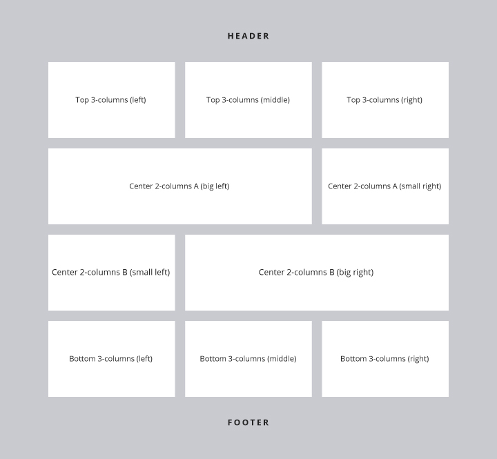
– Front: Top 3-columns (left)
– Front: Top 3-columns (middle)
– Front: Top 3-columns (right)
– Front: Center 2-columns A (big left)
– Front: Center 2-columns A (small right)
– Front: Center 2-columns B (small left)
– Front: Center 2-columns B (big right)
– Front: Bottom 3-columns (left)
– Front: Bottom 3-columns (middle)
– Front: Bottom 3-columns (right)
You don’t have to use all widget areas, you can also just pick a number (or even only one) widget area to include widgets.
Further you have the default Blog Sidebar widget area for the right sidebar of your default blog, single posts and blog archive pages.
You can also optionally include further widgets in the 3-columns Footer widget area by adding widgets to the Footer 3-columns (left), Footer 3-columns (middle) and Footer 3-columns (right) widget area.
3.2. Filling The Widget Areas With Content
Ponsonby Front – Recent Posts widget
This custom widget allows you to include a number of recent posts filtered by categories or tags. You can also choose between 3 different layouts:
– No Featured Image, if you don’t want to show image thumbnails of your posts
– Small Featured Images, for the 3-column widget areas
– Big Featured Images, for bigger thumbnails in the big 2-column widget areas
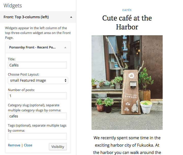
You can decide how many posts you want to include in one widget and which categories and tags the posts you want to show must have. Please be careful that you include the correct category or tag slug, since the category name can differ from the slug (e.g. the slug for the category “Amazing Places” would be “amazing-places”). You can check the slug names in the lists under Posts → Categories oder Posts → Tags.
In the 3-columns and 2-columns small widget areas it is also possible to add the default WordPress widgets and not only Recent Posts. The maximum width of all default widgets then is 160 pixels.
Ponsonby: Quote Widget
Another Ponsonby custom widget is the Quote widget to include on of your favorite quotes or slogans. You can just add your quote/slogan text and the quote author (optional). If you want to add a link to the authors website you can use the following HTML format:
[code]
by <a href =”theauthorurl”>Author Name</a>
[/code]
Ponsonby: Social Links
To include Social links with icons to your widget areas you will first need to create a new custom menu under Appearance → Menus. Give your new menu the name „Social One“ (for further Social Links menus, please use the Menu names “Social Two” and Social Three”) and add your social profile links using the custom „Links“ option. You can include ULRs with your own titles (Navigation Labels) for the following social sites:
Codepen, Digg, Dropbox, Facebook, Flickr, Google+, Instagram, LinkedIn, Pinterest, Path, Dribbble, PollDaddy, GetPocket, Reddit, Skype, StumpleUpOn, Tumblr, Twitter, Vimeo, YouTube, WordPress.com, WordPress.org, Feed (urls with /feed/), Email (using mailto).
With your new social menu you can now return to the Appearance → Widgets area and add your social menu to one of your widget areas using the Custom Menu widget.
Back to Top ↑
4. Theme Options
Under Appearance → Customize you will find all theme customization options for Ponsonby. The great thing about the Customizer is that you can see a live preview of your changes, so you can decide if you like your changes before you save and publish them.
In the Colors tab you can change your header text color, the theme background color and your text link color.
You can also upload your own logo image under Header Image. The maximum width of your logo is 280 pixels. You can then hide the Header text in the Site Title & Tagline tab.
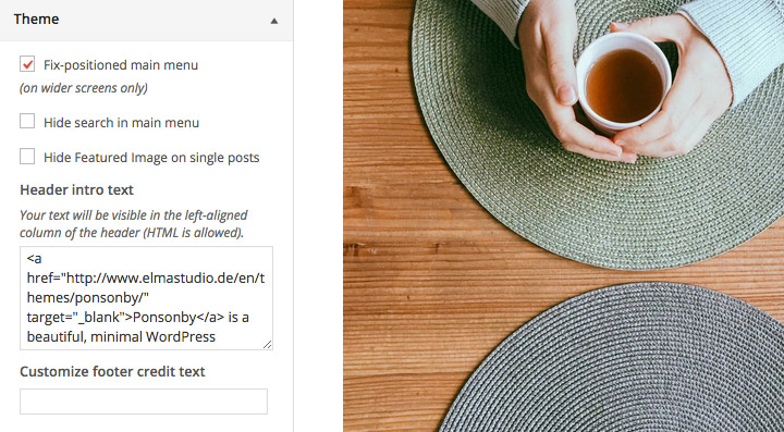
Under Theme you can fix-position your right aligned main menu (only on wider screens), hide the default search option (below the main menu) or choose to hide Featured Images on all single posts.
You can also include a Header Intro text (HTML is allowed) that will show up in the left-aligned header column. And you can also customizer your footer credit text (again HTML is allowed).
A Note on Custom CSS:
To include custom CSS you can use the Custom CSS feature under Appearance → Customize.
Back to Top ↑
5. Custom Menu
To use your own custom menu for the right-aligned Ponsonby main menu you can create a custom menu under Appearance → Menus. Here you can include pages, categories, tags, custom links or post formats and save your menu in the Menu Settings (see at the bottom of your new menu) as “Primary Menu” at the bottom of the menu settings.
Next to the main menu you can also include an optional, additional Header Top menu, which will be visible in the second header column next to your Header slogan text. To use this second menu, just create an additional menu and choose the theme location “Header Top Menu” in the Menu settings.
Back to Top ↑
6. Typography Styles
You can use a number of typography styles to design more interesting posts and pages. (Here is an overview of all typography styles in the Ponsonby live demo).
Dropcaps – To highlight a paragraph with a drop cap letter you can just wrap the first letter of the paragraph in a span tag with the CSS class of “dropcap”.
[code]
<span class=”dropcap”>F</span>irst letter…
[/code]
Intro Text – To highlight a paragraph (e.g. the first paragraph of your text) in a bigger font size, you can wrap the paragraph in a p tag with the CSS class of “intro”.
[code]
<p class=”intro”>Your intro text here…</p>
[/code]
Pull Quotes – You can use pull quotes on your text, by wrapping a sentence or short text in a p tag with the CSS class “pull-left” or “pull-right” for left or right aligned pull quotes.
[code]
<p class=”pull-left”>This is a left-aligned pull quote text.</p>
[/code]
7. Shortcodes
You can find a documentation and code snippets (ready to copy/paste) for all Ponsonby shortcodes on the Ponsonby live demo Shortcode page.
Back to Top ↑
8. Supported Plugins
Ponsonby is ready to be used with the following WordPress plugins:
• Jetpack for Share Buttons, Social Comments, additional Jetpack widgets like the Blog Subscribe widget, the Jetpack Carousel, Tiled Galleries and Infinite Scroll for the default blog and Archive pages.
• Simple Share Buttons Adder for share buttons on posts on pages
• Contact Form 7 for forms
Back to Top ↑
9. Theme Translations
Ponsonby is ready for theme translations. You can add your own translation or customize an existing translation easily using the WordPress plugin Loco Translate. You can also find a detailed plugin description on the plugin homepage. (It would be great if you like to make your Ponsonby theme translation available to other theme users. Please let us know, if you want to share your translation.)
Back to Top ↑
10. Child Theme for Customizations
If you want to customize the Ponsonby theme a little further and you need to change the code in the stylesheet (style.css) or in any of the theme template files, please consider creating a child theme for your changes. Using a child theme is quite easy and saves all your individual changes from being over written by a future update of the Ponsonby parent theme. You can find more information on creating a child theme in the article “WordPress Child Theme Basics” on the Themeshaper blog.
To get started you can download the sample child theme folder for the Ponsonby theme. Download: Ponsonby Child-Theme.
Back to Top ↑
11. Print Doc / Save as PDF
To print out or save a PDF file of this Ponsonby theme documentation, just click in the Print Friendly button below. You can choose to exclude images from your print file or delete certain parts of the text.
 Print or sace as PDF