After I read the newest Responsive Design Newsletter by @justinavery this morning I had a little “aha moment”, because I never heard of his awesome side project Am I Responsive? until today. The screenshot tool lets you create helpful screenshot of your responsive website with just one click and it’s also a lot of fun to see your responsive webdesign appear in such a beautiful presentation.
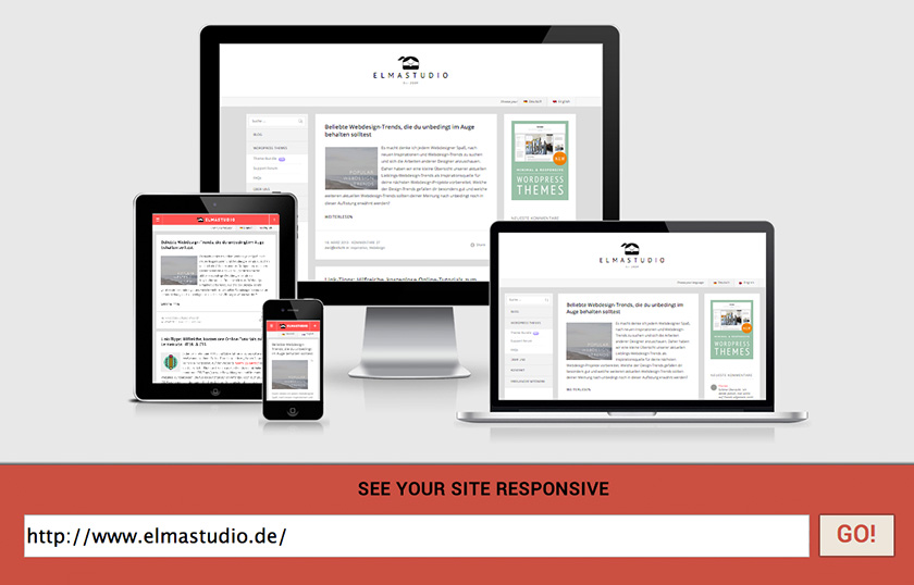
The tool will show your responsive website in a desktop (1600x992px resolution), laptop (1280x802px), tablet (768x1024px) and mobile phone (320x480px) screen and you can even rearrange your setup by draging’n’droping the devices on the screen.
So “Am I Responsive?” is definitely bookmarked, since I think the tool is a beautiful way to create fast responsive website presentation screenshots and to get a first idea how your responsive web design will look on different devices.
Leave a Reply