CSS Grid layouts are definitely one of the most exciting developments in CSS for years. It’s what all web designers and frontend developers have always dreamed of.
Finally, we are able to convert our grid-based web designs directly into CSS without the help of javascript hacks or any kind of weird CSS technics. That sounds super exciting, doesn’t it? With CSS Grid, we can flexibly position any element of a web page just with CSS (such as our header, footer, sidebar or content blocks) exactly where we need it, regardless of its actual position in the markup. Here is a first overview of how this works.
How CSS Grid works
Until now we have done everything we could (floating, flexbox, and javascript hacks), in order to be able to convert our responsive web designs into code. Often we have even reached our limits and certain layouts were simply not easily realized.
All these efforts are finally coming to an end the introduction of CSS Grid layouts(Yeah!). With CSS Grid we can now create grid columns and grid rows (vertical and horizontal lines) inside a container and then place our website elements completely flexible inside this grid.
This new possibility is especially exciting for responsive web design, as we can now react much easier to different screen sizes and much easily adapted layouts with the help CSS Grid and a few added media queries.
Learn the CSS Grid Terminology
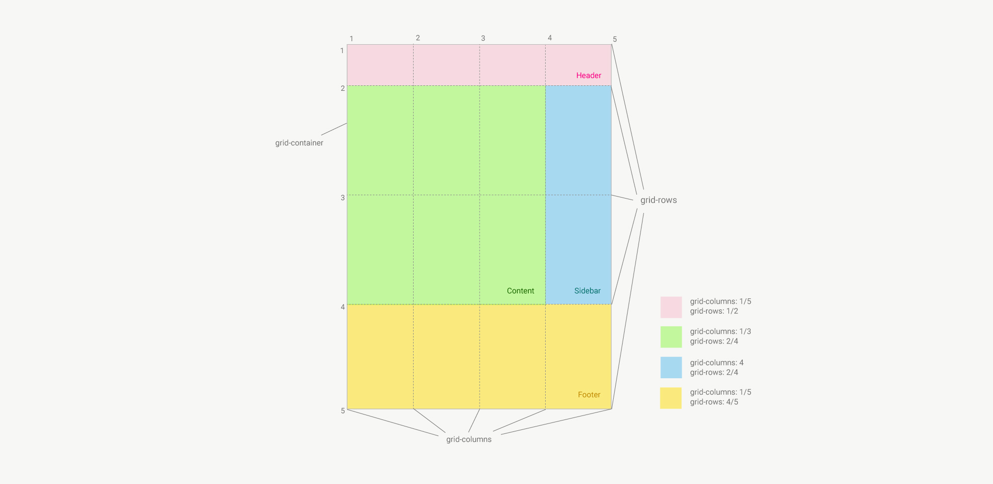
To use CSS Grid we need to learn some new terms, which I have summarized here in a small overview.
Grid container
Grid Container is the element inside the grid will be build. The CSS class to assign to your element is display: grid.
Grid item
Each element, that is directly inside the grid container is a grid item (so all elements that are nested inside the grid items don’t be come grid items themselves).
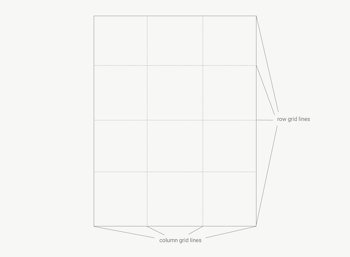
Grid line
There are two different types of grid lines. The vertical lines are called “grid columns” and the horizontal grid lines are called “rows”.
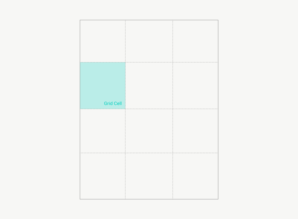
Grid cell
Each cell of the grid is called grid cell. A grid cell is defined by two grid columns and two grid rows.
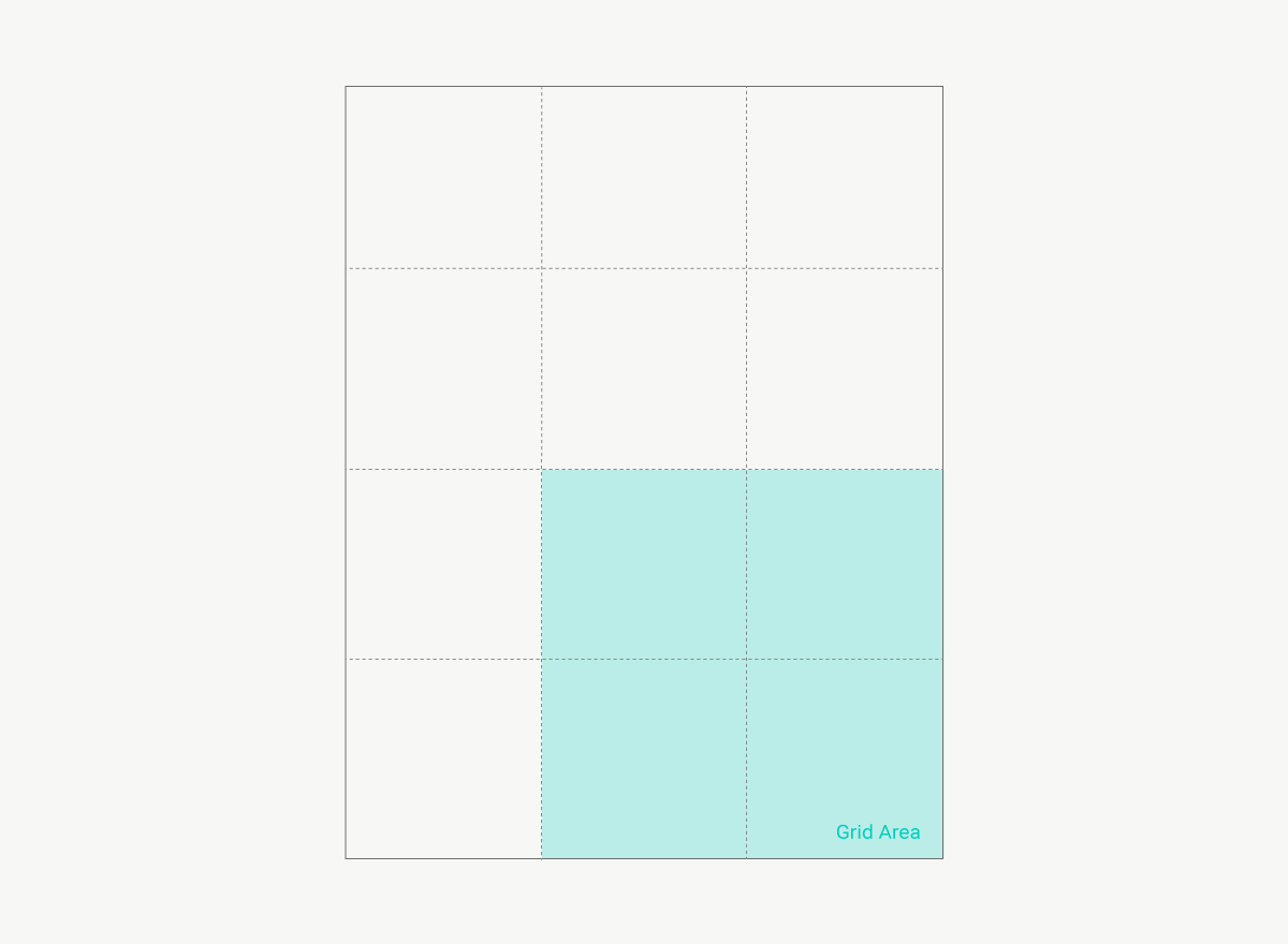
Grid area
Multiple cells together are called a grid area.
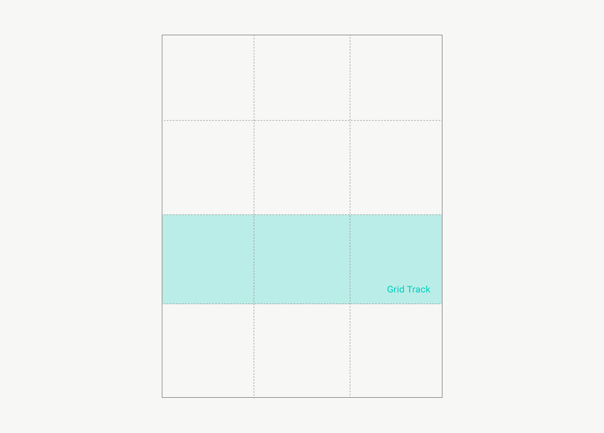
Grid track
A Grid track is the space between two column lines or two grid lines.
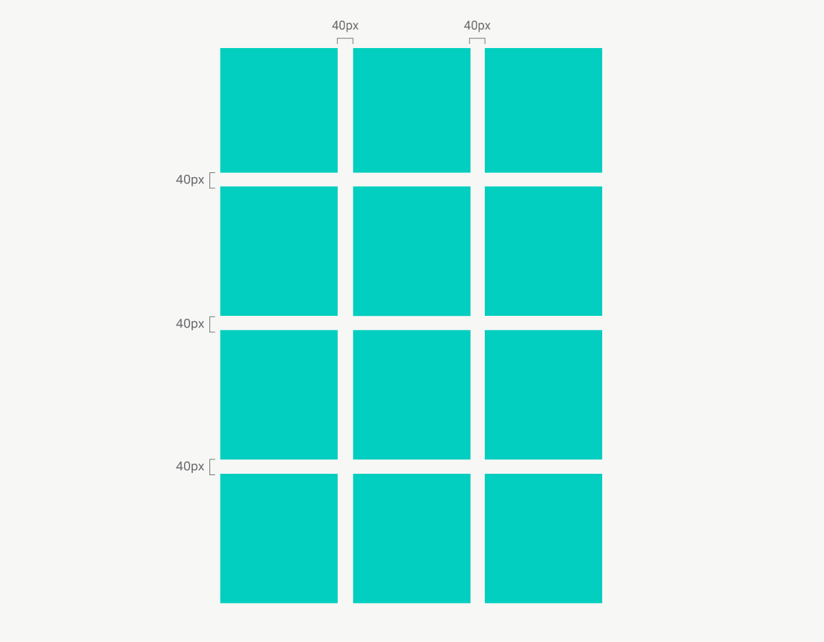
Grid gap
Grid columns and rows can have a grid gap, which is mostly called gutter in traditional design grids. It can have a fixed pixel value of e.g. 40px. It’s important to note that in CSS grid the gaps are not added to the first grid lines, so not at the outside of the grid, which is in contrary very common in traditional design grids.
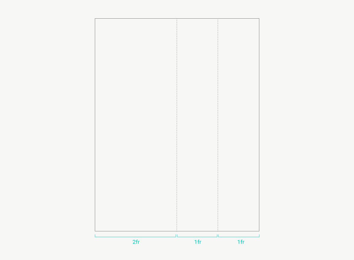
The value fr
fr (which stands for fraction) is a new value created for CSS grid. grid-container: 1fr means, that one fraction of the available space will be used.
Grid template column
So you can add your grid columns to your grid container like this:
grid-template-columns: 2fr 1fr 1fr;
The layout result will look like this:
Grid template rows
The default value for grid rows is “auto”. This means the content inside the grid row will define the height of the row. You can also add pixel or percentage values.
grid-template-rows: 120px 25% auto;
CSS Grid Browser Compatibility
Of course, at the moment there are still some older browsers that cause trouble and don’t offer CSS Grid support (which right now is mainly Internet Explorer 11).
It’s best to check the caniuse.com website on a regular basis, to see the current state of browser support for CSS grid. Windows Edge was still an issue a few months back, but the latest version now supports CSS grid.
Can we use CSS Grid now?
At Elmastudio we are currently working to integrate some CSS Grid functionality to our newest WordPress theme Pukeko. In my opinion, a reasonable approach to the use of CSS Grid today is to recognize that not all browsers have to display a web design in the exact same way, and of course we are already all used to this since responsive web design is around.
Morten Rand-Hendriksen explains this approach in his CSS Grid Presentation from WordCamp Europe 2017, where he describes his approach to use CSS grid today. He says we should realize that a website looks different in different browsers and on different screen sizes and we can also use this for CSS grids.
He suggests (and I also think this approach is the best solution at the moment) creating a mobile-first web design without the help of CSS grid and offer this web design for older browsers that don’t support CSS grids as well.
Then you can add to use CSS grid functionality for modern browsers and bigger screen sizes using Media Queries, in order to create your more complex, multi-column web design.
This is the only way we, as web developers, can help to push the development of modern tools forward. By adopting new options as early as possible we can guarantee that they will become the new standard faster and that browser compatibility for CSS grids is soon an issue of the past.
Your Feedback
What are your thoughts on CSS Grid and what questions do you have? Are you using CSS Grid and maybe even built a live website already? Do you know other helpful resources on the topic and at what time do you think CSS Grids will be norm?
Just write me a comment with your questions and your thoughts below, I’m looking forward to your feedback.
Further helpful resources to learn CSS Grid
– CSS Tricks detailed guide A Complete Guide to Grid.
– The A Book Apart book A New CSS Layout by Rachel Andrew.
– All CSS grid related posts on Smashing Magazine.
– Morten Rand-Hendriksens talk CSS Grid Changes Everything (About Web Layouts) at WordCamp Europe 2017.
– The Layout Land Youtube channel with a number of super helpful videos explaining CSS Grid.
– The detailed resource list Learn CSS Grid on Jen Simmons blog.
Reading time: about 4 minutes


Leave a Reply